


Affiliate disclosure: This article contains affiliate links. If you click and purchase, we may earn a commission at no extra cost to you.
Table of Contents
◉ Introduction ◉ What Photoshop’s Free Adobe Stock Images Actually Are ◉ Setting Up Your Working Canvas ◉ Three Ways to Add Free Adobe Stock Images Inside Photoshop ◉ Building a Stylized Travel Collage Step by Step ◉ Pros, Cons, and Risks of Using Free Adobe Stock in Photoshop ◉ Mini Case Study: From Creative Brief to Collage Hero Image ◉ Common Mistakes and Expert Fixes ◉ Advanced Tips to Push This Workflow Further ◉ FAQ: Working with Free Adobe Stock Images in Photoshop ◉ Conclusion: Turn Free Assets into Signature Visuals
Visual storytelling sits at the center of modern design. Whether you’re building a blog hero, a YouTube thumbnail, or a promo slide, you’re constantly asked to create compelling visuals faster and cheaper—often with limited resources. That’s exactly where Photoshop’s integration with free Adobe Stock images becomes a secret weapon.
Inside Adobe Photoshop, you can search thousands of high-quality free photos, place them directly into your document as smart objects, and then blend them together with masks, blend modes, and color grading. With a solid workflow, those “generic stock photos” turn into a cohesive, stylized collage that feels intentional and on-brand.
This guide walks you through that process step by step. You’ll learn three different ways to access free Adobe Stock images from Photoshop, how to promote them into a full-resolution working file, and how to build a retro-inspired travel collage using layer masks, gradient maps, and creative type. You’ll also see common mistakes to avoid, licensing considerations to keep in mind, and practical tips for pushing the style further for real-world client work.
🏃♂️ Don’t have Photoshop yet?
Get the full version FREE for 7 days and follow this collage tutorial step-by-step.
Start Free Photoshop Trial
Get the full version FREE for 7 days and follow this collage tutorial step-by-step.
Start Free Photoshop Trial
1. What Photoshop’s Free Adobe Stock Images Actually Are
Photoshop’s free Adobe Stock integration is more than a random “free images” button. It’s a streamlined gateway into a curated collection of royalty-free photos and graphics that you can use in many personal, educational, and commercial projects.
When you place these assets through Photoshop:
• They arrive as smart objects, which means you can scale, transform, and apply filters non-destructively.
• You avoid the friction of opening a browser, downloading files, and dragging them into your project manually.
• You work within a consistent licensing framework instead of juggling assets from multiple free sites with unclear terms.
You can also browse the free collection directly at Adobe Stock’s website by filtering for Free in the search interface, but staying inside Photoshop keeps your workflow faster and more focused.

1.1 What “Free” Means from a Licensing Perspective
“Free” does not mean “no rules.” In broad strokes, Adobe’s free assets are typically covered by a standard commercial license. In practice, that usually implies:
• You can use the images in personal and many commercial contexts, including client work.
• You can incorporate them into web graphics, social posts, presentations, and most print materials.
• You should not treat the stock photo itself as a standalone product (for example, reselling a stock photo as a poster where the photo is the main value).
• You must avoid offensive, defamatory, or misleading usage, particularly with recognizable people.
You’re responsible for checking Adobe’s current licensing terms every time you plan high-volume or sensitive use, but for most designers, marketers, and content creators, the built-in free collection is more than sufficient for everyday work.
2. Setting Up Your Working Canvas
Before you start dragging in images, you need a canvas to work on. The way you set up that canvas can give you more control over resolution and flexibility later.
2.1 Create a Temporary Starter Document
Start by creating a simple “container” document:
• Launch Photoshop.
• Go to File › New.
• Set the size to 1920 × 1080 pixels (a standard HD frame).
• Use RGB color if you’re designing for screens.
This document is temporary. Its main purpose is to receive your first free image as a smart object so you can then promote that image into its own, full-resolution working file.
2.2 Place the First Free Image and Promote It
Once the starter document is open, place your first stock image—let’s say a map, which works well as a travel-themed background.
1. Use one of the free Adobe Stock interfaces (we’ll cover them in detail later) to search for a map image.
2. Click Add or Place to insert it. Photoshop downloads the asset and places it as a smart object.
3. Tap the Move tool (V) to confirm placement.
At this point, you’ll notice the image is constrained to your 1920 × 1080 canvas and might not show its full resolution. To make the most of it:
• Double-click the smart object icon in the layer thumbnail.
• Photoshop opens the embedded content in a new PSB file at its full native resolution.
• Close the original 1920 × 1080 document.
• Continue working inside the PSB—this becomes your main collage document.
This “promotion” trick ensures you’re working with maximum detail, which is critical if you plan to crop, zoom, or repurpose the artwork later.
3. Three Ways to Add Free Adobe Stock Images Inside Photoshop
Photoshop gives you several entry points into the free Adobe Stock library. They all end with an image placed as a smart object, but they differ in how you search and how they fit into your workflow.
3.1 Method 1: Using the Contextual Taskbar
Newer versions of Photoshop include a contextual taskbar that floats near your canvas and offers quick actions based on what you’re doing. One of those actions can be searching for and adding stock images.
Typical workflow:
• Open your working document.
• Click the taskbar when it appears near the canvas.
• Look for the option to browse or add free Adobe Stock images.
• Type a keyword like “map”, “city”, or “ocean”.
• Select an image and click Add to place it as a smart object.
This is a fast way to pull in background images, textures, or supporting visuals while you’re already focused on layout and composition.
3.2 Method 2: Using the Toolbar Icon
After you’ve added your first free image, Photoshop typically exposes a dedicated control to keep doing it. In many setups, you’ll see an icon labeled something like “Add free Adobe Stock” inside the main toolbar.
Here’s how you can use it as you build your collage:
• Select the Add free Adobe Stock tool from the toolbar.
• Search for a term such as “travelers” to find people-centric shots.
• Choose an image that fits your theme (for example, a person standing near a suitcase or looking at a landscape).
• Click Add and then scale and position the smart object with the Move tool (V) and transform handles (hold Shift to constrain proportions).
This method is ideal for adding your primary subject or additional elements while you’re fine-tuning your composition.
3.3 Method 3: File › Place Free Adobe Stock Images
If you prefer classic menu workflows, you can access free images from the File menu, which feels familiar if you’re used to “Place Embedded” or “Place Linked”.
• Go to File › Place free Adobe Stock images…
• Enter a keyword—for a travel collage, “van”, “camper”, or “road trip” works well.
• Scroll through the results and pick an image that matches the lighting and color of your background.
• Click to place it as a smart object.
• If you need to flip it for better visual flow, use Edit › Transform › Flip Horizontal or the flip icon in the options bar.
This option is great when you want to stay firmly in the traditional Photoshop menu workflow or when you’re already in the habit of placing assets via File › Place.
3.4 How the Three Methods Compare
| Method | Interface Location | When It’s Most Useful |
|---|---|---|
| Taskbar (Search & Add) | Floating contextual taskbar | Fast, in-context browsing while you’re actively editing |
| Toolbar “Add free Adobe Stock” | Main tools panel | Dropping multiple stock images into an existing composition |
| File › Place Free Adobe Stock | Top menu bar (File) | Traditional, menu-driven workflows and precise file placement |
Functionally, they all give you smart objects from the free collection. Your choice comes down to personal preference and how you like to work.

Build Stylized Travel Collages with the Latest Photoshop
Use Photoshop’s integration with free Adobe Stock images to create on-brand, retro-inspired collages in just a few clicks.
Get Photoshop Now4. Building a Stylized Travel Collage Step by Step
Once you know how to bring in images, the next step is turning them into a cohesive collage. The key techniques here are blend modes, layer masks, and adjustment layers.
The example below assumes:
• A map as the foundation layer.
• A van or similar travel vehicle layered on top.
• A main traveler portrait.
• A small group of travelers as a supporting element.
• Some retro-inspired text and global color grading to finish it off.
4.1 Blending the Map and Van with Layer Blend Modes
Start with your background map and place the van on a layer above it as a smart object. The default Normal blend mode usually looks flat and pasted. To integrate the van into the map:
• Select the van layer.
• In the Layers panel, change Normal to Multiply.
Here’s what Multiply does in this context:
• Light areas (especially whites) in the van image fade out.
• Darker colors combine with the underlying map.
• The whole thing starts to resemble ink printed on paper rather than two separate photos.
You can experiment with other blend modes as well:
• Darken group: hides lighter pixels in the blend layer and preserves darker ones.
• Lighten group: hides darker pixels and emphasizes lighter ones.
• Overlay/Soft Light: boosts contrast and can give a punchy, stylized look.
• Color and Luminosity: swap color and brightness information between layers.
For a travel collage with a vintage feel, Multiply is often a strong starting point.
4.2 Blending the Main Traveler with a Horizontal Gradient Mask
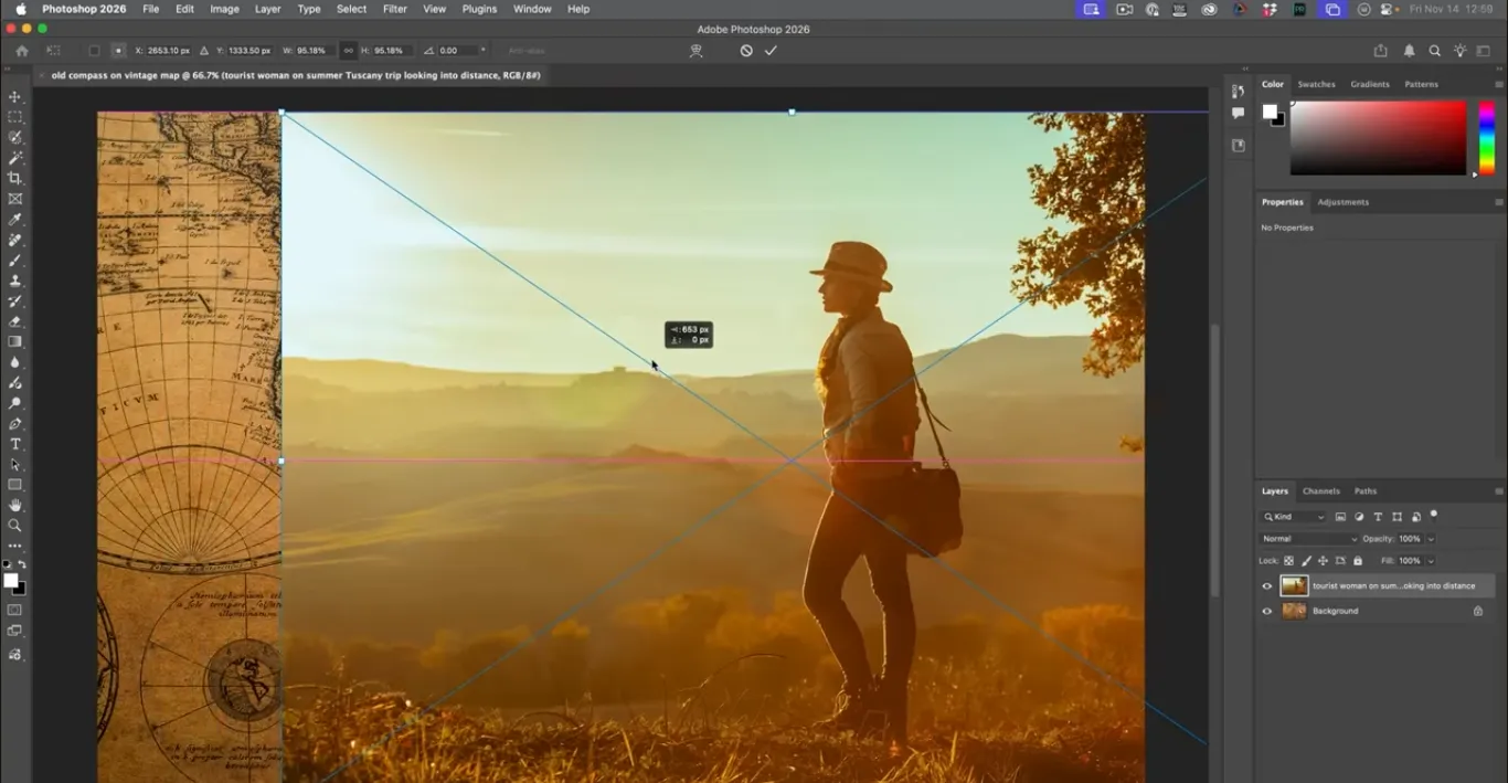
Next, bring in your main subject—a traveler, backpacker, or remote worker—and place them above the van and map.
1. Select the traveler layer.
2. Click the Add Layer Mask icon at the bottom of the Layers panel.
3. Press G to select the Gradient tool.
4. In the top options bar, choose the black-to-white gradient under Basics.
5. Set the gradient type to Linear, blend mode to Normal, and opacity to 100%.
Now click and drag across the canvas in the direction you want the blend: for example, from left to right so the right side of the traveler gradually fades into the map and van.
If the fading happens in the wrong direction, toggle the Reverse checkbox in the gradient options and drag again.
This creates a smooth, directional blend where:
• White areas on the mask keep the traveler fully visible.
• Black areas hide the traveler and reveal the background.
• The gray transition between them creates a soft fade.
4.3 Recovering Full Detail on the Traveler with Select Subject
Sometimes you want a gentle blend around the edges but a fully visible person in the center. You can combine your gradient mask with an automated selection:
• Make sure the traveler layer is selected.
• Go to Select › Subject. Photoshop analyzes the image and creates a selection around the person.
• Click the layer mask thumbnail in the Layers panel so the mask, not the image, is active.
• Set your foreground color to white.
• Use Alt/Option + Backspace to fill the selection with white, or paint over the selection with a large soft brush.
On a mask, white means “show this completely,” so the traveler becomes fully opaque again while the gradient still fades them into the background at the edges.
If you need an extra degree of control:
• Duplicate the traveler layer with Ctrl/Cmd + J.
• Use one copy for the subtle blended version and another for a fully solid version on top, perhaps with a slight glow or outline.
4.4 Adding a Subtle Glow Around the Subject
To separate your subject from a busy collage, a very soft glow can help:
• Select the traveler layer (or the duplicated copy).
• Open Layer Style by double-clicking the layer’s blank area.
• Enable Outer Glow.
• Choose a warm, light color (for example, a pale yellow or cream).
• Keep Spread low for a softer edge, and adjust Size to control how far the glow extends.
• Reduce Opacity until the glow is barely perceptible—this should enhance separation, not scream “special effect.”
This technique adds depth and focus without making the subject look pasted on.
4.5 Blending a Group of Travelers with a Radial Gradient Mask
For extra storytelling, you can add a smaller group of travelers near the top of the collage—maybe a circle of friends or a group at an overlook.
1. Use any of the three methods to add a group of travelers image.
2. Position it near the top, where it balances the composition.
3. Add a layer mask to this layer.
4. Select the Gradient tool (G) again.
5. Choose a Radial gradient with the same black-to-white color setup.
Click near the center of the group and drag outward. The center stays visible while the edges fade away, creating a vignette-like effect. If you accidentally end up with a transparent center and visible edges, toggle Reverse and drag again.
You can refine the blend by redrawing the gradient until the hard edges disappear into the background.
4.6 Harmonizing Colors with a Photo Filter Adjustment
At this point, you might have images shot in different lighting conditions: one cool, one warm, one neutral. To unify them:
• Add a Photo Filter adjustment layer from the Adjustments panel or via the half-filled circle icon in the Layers panel.
• Choose a warm filter or set a custom color.
• Increase the Density until the collage feels cohesive.
If you only want to affect a specific layer (for example, just the group of travelers or just the van), click the clip icon (or Alt/Option + click between layers) to clip the Photo Filter so it only affects the layer directly below.
This gives you precise control over how each element contributes to the overall color mood.
4.7 Designing Retro-Style Title Text
A travel collage needs a headline—something like “Summertime Traveling” or “Road Trip Season”.
1. Select the Type Tool (T) and click on the canvas.
2. Type your title text.
3. Use Ctrl/Cmd + T to scale and position the text.
4. With the text layer active, experiment with bold, playful fonts that match a travel or retro vibe.
5. Once you have a base font, go to Type › Warp Text… and choose Flag or a similar warp for a subtle wave.
To create a glowing outline effect:
• Open Layer Style for the text layer.
• Add an Outer Glow with a bright, warm color.
• In Blending Options, reduce Fill Opacity to 0%. This hides the solid text and leaves only the glow visible.
• Add a Drop Shadow, set its color to white, Distance to 0, and adjust Size and Opacity to create a second, softer glow.
Now your title looks like luminous lettering instead of flat text, and it fits the vintage travel poster aesthetic.
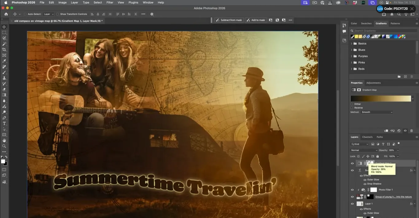
4.8 Global Color Grading with Gradient Maps
For the final pass, use a Gradient Map to give the collage a cinematic or film-like color palette:
• Add a Gradient Map adjustment layer at the top of the layer stack.
• Make sure it is not clipped, so it affects the entire image.
• Click on the gradient strip to open the editor.
• Explore preset gradients that emulate film or retro color schemes (if you’ve enabled legacy or photographic presets in your version of Photoshop).
• Choose a gradient that fits your story—warm highlights, teal shadows, faded midtones, etc.
• Lower the Opacity of the Gradient Map layer until the effect feels like a grade, not a filter.
This step pushes the collage from “stack of images” into “finished poster.”
5. Pros, Cons, and Risks of Using Free Adobe Stock in Photoshop
5.1 Benefits for Designers and Content Teams
Using free Adobe Stock assets directly inside Photoshop brings several practical advantages:
• Speed: You avoid separate browser searches and file downloads. Everything happens inside the app.
• Quality: The free collection is curated, so you’re not digging through low-res or poorly exposed images.
• Consistency: Smart objects and adjustment layers help you maintain consistent quality and non-destructive edits.
• Cost control: Free assets reduce the need for one-off purchases or additional subscriptions, which is especially helpful for freelancers and small teams.
5.2 Trade-Offs and How to Manage Them
There are also some risks and limitations you should keep in mind:
• Visual sameness: If you rely heavily on generic stock, your brand can start to look like everyone else’s. The collage approach—combining multiple stock images with strong color grading—helps reduce that risk.
• Licensing boundaries: “Free” assets still come with conditions. Certain high-volume prints, resales, or sensitive contexts may require different licensing. Always check Adobe’s official terms before committing to a big campaign.
• Context and ethics: Images with recognizable people must not be used in misleading or harmful contexts (such as implying medical conditions, political affiliations, or endorsements they haven’t agreed to).
Best practice: treat stock assets as raw material rather than finished products. The more you transform, combine, and color-grade them, the more unique—and safer—your final result tends to be.
6. Mini Case Study: From Creative Brief to Collage Hero Image
Imagine you’re designing a hero image for a tech or productivity blog article called “Build a Life You Can Work and Travel From.”
Brief:
• Subject: Travel + remote work.
• Placement: Blog hero, email header, and social media promo.
• Tools: Photoshop + free Adobe Stock only.
Here’s how you might execute using the techniques from this guide:
• Foundation: Start with a map or abstract aerial photo of roads and landscapes as your base layer. Promote it into a PSB to work at full resolution.
• Secondary elements: Add a van or camper, set it to Multiply, and align it so it “drives” along part of the map.
• Main subject: Drop in a portrait of a traveler or remote worker with a laptop. Use a linear gradient mask plus Select Subject so their figure blends into the background but the face and core silhouette remain sharp.
• Supporting story: Add a small group of travelers near the top, blended with a radial gradient mask so they feel like a vignette of friends or colleagues.
• Color harmony: Apply a Photo Filter to warm everything up and clip or unclip it as needed to keep faces natural while backgrounds stay stylized.
• Typography: Add a title like “Work from Anywhere” using warped, glowing text that channels a retro postcard design.
• Global grade: Finish with a Gradient Map for filmic toning, then export in multiple aspect ratios for different platforms.
The result is a hero image that tells a story at a glance, relies entirely on free Adobe Stock photos, and looks substantially more custom than a single stock photo with text slapped on top.
7. Common Mistakes and Expert Fixes
Even experienced designers fall into a few predictable traps when using stock images in Photoshop. Here are some of the big ones—and how to avoid them.
7.1 Flattening or Rasterizing Too Early
Flattening or rasterizing smart objects and adjustment layers too early locks in your edits.
Fix:
• Keep smart objects and masks intact until you’re ready to export.
• Use adjustment layers rather than direct edits to color and contrast.
• Save a layered master PSD or PSB, and export separate flattened versions for delivery.
7.2 Relying Only on Opacity
Lowering a layer’s opacity without trying blend modes often makes things look washed-out and lifeless.
Fix:
• Experiment with Multiply, Overlay, Soft Light, and Screen before touching opacity.
• Use opacity as a fine-tuning control after you’ve found a promising blend mode.
• Cycle through blend modes quickly with keyboard shortcuts (Shift + Plus/Minus) to discover happy accidents.
7.3 Messy, Hard-Edged Masks
Hard brush edges around subjects or visible rectangular edges from pasted images scream “amateur collage.”
Fix:
• Use soft brushes when painting on masks.
• Combine Gradient masks with Select Subject for smooth yet precise blends.
• Zoom out frequently to check the overall effect. If an edge calls too much attention to itself, refine the mask.
7.4 Inconsistent Color and Contrast
Pulling images from different sources can leave you with clashing color temperatures and contrast levels.
Fix:
• Use Photo Filter, Color Balance, Curves, or Gradient Map adjustment layers to unify the palette.
• Clip adjustments to individual layers when needed, then add one or two global grading layers at the top.
• Consider adding a subtle, consistent grain or texture using smart filters or overlays to tie everything together.
7.5 Ignoring Usage Limits or Context Restrictions
It’s easy to forget that even free assets have usage limits and context guidelines.
Fix:
• Before printing or massively distributing a design, review Adobe’s current license documentation.
• Avoid using recognizable people in contexts that could be considered offensive, defamatory, or misleading.
• When in doubt, consult legal or brand compliance teams for high-stakes campaigns.
8. Advanced Tips to Push This Workflow Further
Once you’re comfortable creating collages like this, you can extend the workflow into more advanced production practices.
• Use Libraries: Save frequently used colors, text styles, and stock images into Creative Cloud Libraries so you can reuse them across multiple collages and campaigns.
• Smart Filters: Apply effects like Camera Raw Filter, Gaussian Blur, or Noise to smart objects so you can tweak or disable them later without degradation.
• Multi-Platform Output: Use Photoshop’s artboards or export options to generate different crops from the same master file (for example, 16:9 for YouTube, 4:5 for Instagram, 1:1 for profile graphics).
• Hybrid Assets: Combine free Adobe Stock images with your own photos or illustrations, using the same blend modes and gradient maps to make them feel cohesive.
• Template Building: Turn your collage layout into a reusable template where you swap images and text while keeping the same masks, adjustment layers, and overall color grade.
The underlying idea is that you’re building a system, not just a one-off artwork. That system can support everything from travel campaigns to SaaS hero images to course thumbnails.
9. FAQ: Working with Free Adobe Stock Images in Photoshop
### 9.1 Can I use Photoshop’s free Adobe Stock images in paid client work?
In many cases, yes. Free Adobe Stock assets are generally offered under a commercial-friendly license that allows use in client projects, marketing materials, and other professional work, within defined limits. You should always confirm the current licensing terms on Adobe’s site before large-scale or sensitive projects.
### 9.2 What’s the difference between free and paid Adobe Stock assets?
Free assets cost you nothing to license and are part of a curated subset of Adobe Stock. Paid assets typically offer a broader and deeper library, including premium photography and sometimes additional licensing options for very high-volume use or resale scenarios. From a Photoshop workflow point of view, both free and paid images behave similarly when placed as smart objects.
### 9.3 Can I turn a free Adobe Stock image into my logo or trademark?
No. Stock images—whether free or paid—are not meant to be registered as logos or trademarks. You can incorporate them into surrounding brand materials, but your core logo should be custom-created or specifically licensed for that purpose.
### 9.4 Is it okay to use these images on merchandise like posters or T-shirts?
It depends on the context and volume. Using stock imagery in designs that will be sold as merchandise can involve different licensing requirements, especially when the stock photo is the main value of the product. Before producing merchandise, review Adobe’s license documentation and confirm whether you need a different tier of license.
### 9.5 Does using stock imagery hurt the originality of my brand?
It can—if you drop a stock photo on a background, add text, and stop. The key is transformation. By combining multiple stock assets, adding custom typography, using masks and blend modes, and applying distinctive color grading, you can create visuals that feel unique to your brand while still benefiting from the speed and affordability of stock.
10. Conclusion: Turn Free Assets into Signature Visuals
Photoshop’s integration with free Adobe Stock images gives you a powerful combination: high-quality source material plus professional compositing tools, all in one environment. When you:
• Start from a flexible working canvas,
• Place free stock images as smart objects,
• Blend them with masks and blend modes,
• Harmonize them with adjustment layers, and
• Finish with strong typography and gradient-map color grading,
you move far beyond generic stock photography. You build custom, on-brand visuals that are fast to produce and easy to adapt.
Your next move is simple: open Photoshop, create a starter document, pull in a map, a vehicle, a traveler, and a small group of people, and follow the steps in this guide. Once you’ve built one travel collage, repeat the process with different themes—tech, productivity, education, or whatever your content demands.
The assets might be free, but the style, structure, and storytelling you layer on top are where your real value as a designer and content creator shows up.
Elevate Your Collages with Adobe Photoshop →