


Affiliate disclosure: This article contains affiliate links. If you click and purchase, we may earn a commission at no extra cost to you.
Table of Contents
◉ Understanding the Poster Design You’re Recreating ◉ Setting Up Your Photoshop Document ◉ Building the Background and Color Palette ◉ Creating the Rectangular Panels and Borders ◉ Inserting Car Images with Clipping Masks ◉ Typography: Building a Clean, Readable Layout ◉ Adding a Plastic Texture Overlay for a Trendy Finish ◉ Pros, Cons, and Risk Management of This Photoshop Workflow ◉ Mini Case Study: Turning the Tutorial Layout into a Launch Poster ◉ Common Mistakes and Expert Tips ◉ FAQs: Poster Design in Photoshop ◉ Next Steps: Practice, Iterate, and Build Your Poster System
Designing a polished poster in Adobe Photoshop can feel intimidating if you’re not used to building layouts from scratch.
In this article, you’ll learn how to recreate that look in a structured, repeatable way. You’ll start by setting up the right canvas size, then build a soft, atmospheric background with brushes and color fills. From there, you’ll construct a grid of rectangles, clip car photos inside them like a gallery, and finish the design with typography and a trendy plastic texture overlay.
You don’t need to be a Photoshop expert to follow along. If you understand basic layers and tools, you’ll be able to complete this poster. The instructions are structured so you can follow them at your own pace, even if you’re just starting out. By the end, you’ll have a professional-looking car poster—and a framework you can adapt for any visual campaign.
🏃♂️ Don’t have Adobe Photoshop yet?
Get the full version FREE for 7 days and follow this car poster tutorial step-by-step.
Download Photoshop Free Trial
Get the full version FREE for 7 days and follow this car poster tutorial step-by-step.
Download Photoshop Free Trial
Understanding the Poster Design You’re Recreating
Before you start clicking around, it helps to understand what you’re actually building.
In this approach, you’ll design a vertical poster with:
• A green, brush-painted background that matches the hero car
• Three rectangular panels stacked in a column, each containing a different car photo
• Thin strokes and subtle inner shadows on the rectangles to add depth
• A plastic texture overlay on top of everything for a crumpled, glossy effect
• Headline, subheading, and paragraph text arranged in a clean, editorial layout
At a glance, the result looks like something you’d see in a premium automotive campaign. Under the hood, though, it’s just a smart combination of:
• Solid color adjustment layers
• Soft round brushes with low flow
• Vector rectangles with layer styles
• Clipping masks for images
• Blending modes and layer masks for texture
Once you understand those building blocks, you can change the subject (cars, sneakers, gadgets), the color palette, or the typeface and still use the same structure.

Design High-Impact Car Posters with Adobe Photoshop
Unlock Smart Objects, Camera Raw, and powerful layer controls to build reusable poster layouts for cars, products, and campaigns in a fraction of the time.
Get Photoshop (Free 7-Day Trial)Setting Up Your Photoshop Document
The first step is all about getting the document size right so your poster looks crisp and balanced.
Choose the right canvas size
In this guide, you’ll use **21 x 29.7 cm**, which corresponds to an A4 ratio. That’s a good starting point because it’s:
• Easy to print on standard home or office printers
• Simple to scale up to A3 or down to smaller flyers
• Close to a vertical format that works well for social media stories and pins
In Photoshop:
1. Go to **File → New**.
2. Set **Width** to 21 cm and **Height** to 29.7 cm.
3. For print, set **Resolution** to **300 ppi**. For web-only use, 150–200 ppi is usually enough.
4. Use **RGB Color** if you’re designing primarily for screens; use **CMYK Color** if you know this is going straight to a professional printer.
Name and organize from the start
Give your document a descriptive name like `green_car_poster_v1`. From the beginning, plan to keep your:
• Background in one folder
• Rectangles and images in another folder
• Text in a separate text folder
• Texture on a top-level layer
Good organization makes it much easier to iterate on the design later without getting lost.
Building the Background and Color Palette
Next, you’ll create the green, atmospheric background that sets the tone for the entire poster.
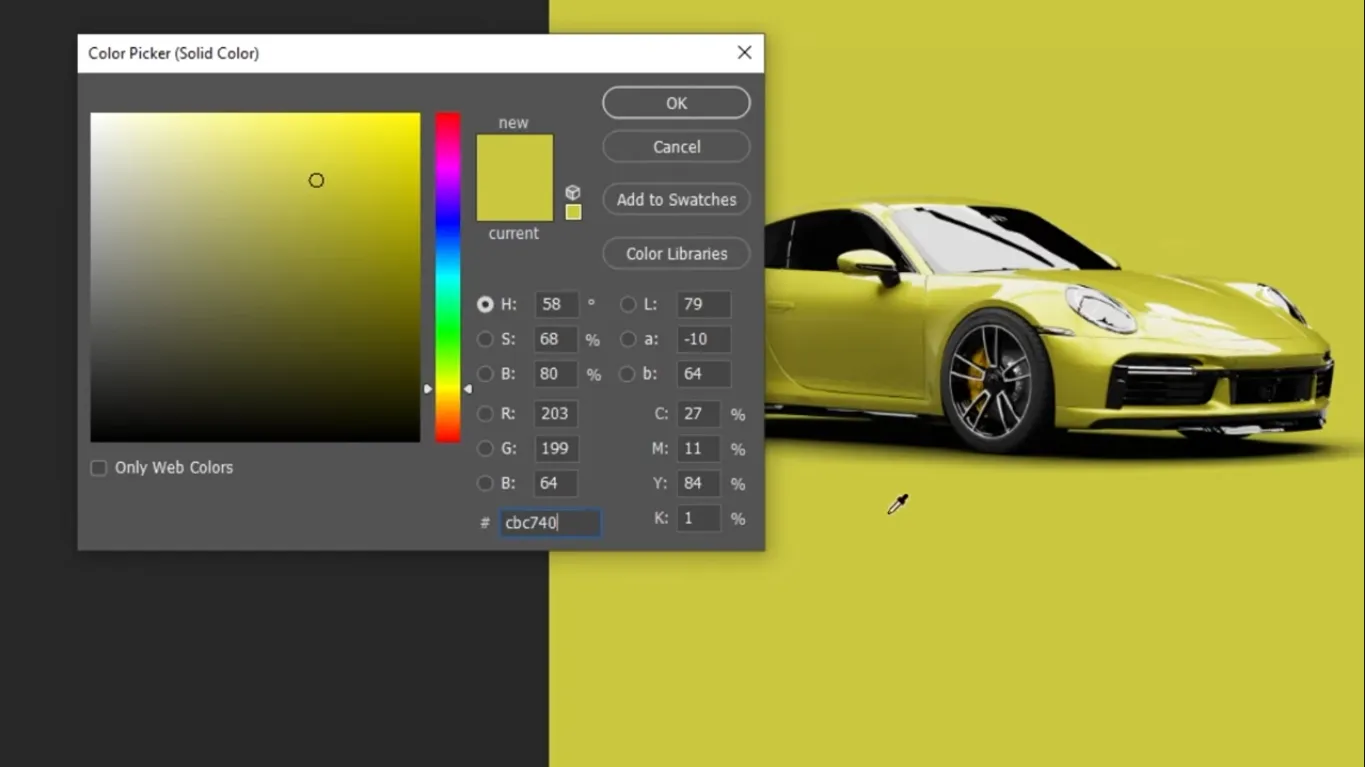
Step 1: Add a solid color background
Instead of painting the whole background manually, use an **adjustment layer**. Adjustment layers are non-destructive, meaning you can tweak them anytime without damaging your artwork.
1. In the **Layers** panel, click the **Adjustment Layer** icon (the half-filled circle).
2. Choose **Solid Color**.
3. Pick a **medium green** that loosely matches your main car image. The idea is to harmonize the poster with the subject, not match it perfectly.
4. Click **OK**.
You now have a flexible, editable background that you can recolor later with a single click.
Step 2: Add depth with soft brush painting
Create a new layer above the solid color and use soft brushes to add subtle gradients around the car area.
1. Create a **new empty layer** above the solid color.
2. Press **B** to select the **Brush Tool**.
3. Choose a **Soft Round** brush from the brush presets.
4. Set **Opacity** to 100%, but lower the **Flow** to something like 10–20%. Flow controls how quickly the paint builds up, so lower flow gives you smoother shading.
5. Sample a **slightly lighter green** and paint softly around where the car will sit.
Then, repeat the process with an even lighter green on another new layer, painting broader areas of the background. This builds an organic, atmospheric gradient instead of a flat, boring fill.
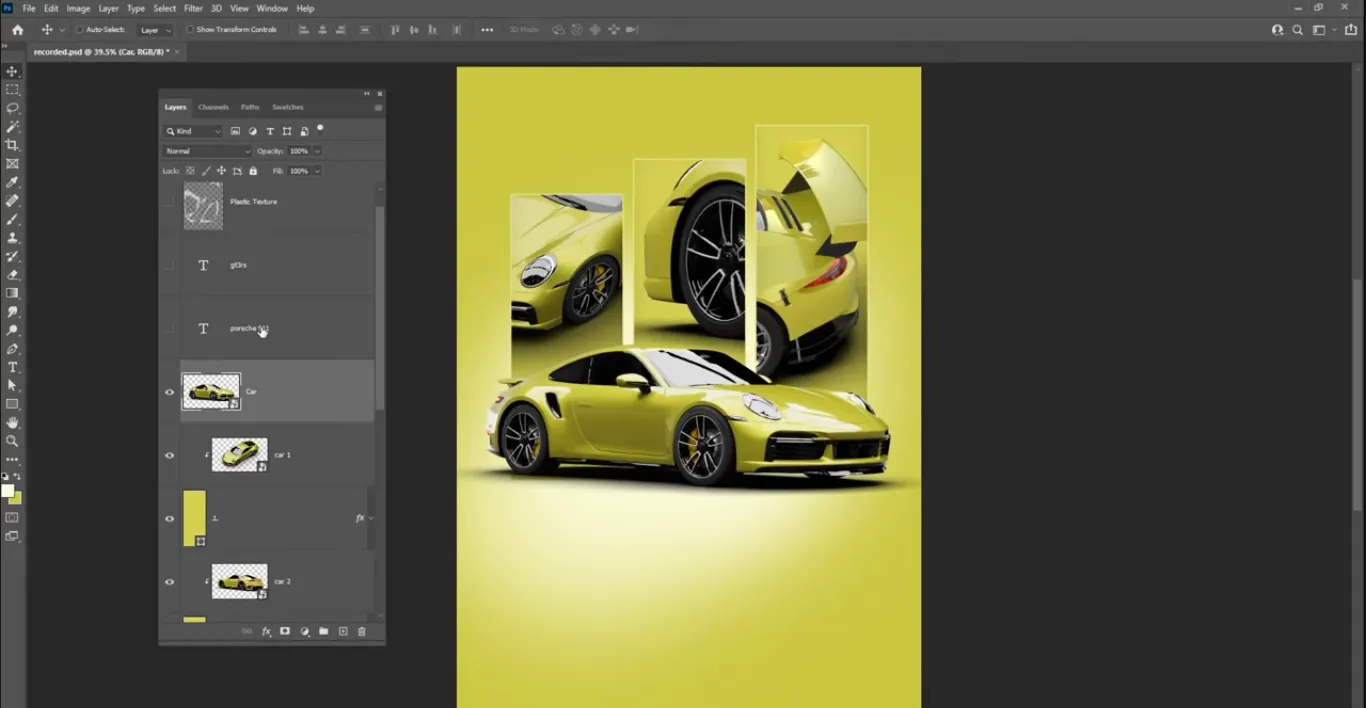
Creating the Rectangular Panels and Borders
The next phase is constructing the three vertical rectangles that will hold your car images. This is where the layout starts to feel like a real poster.
Draw the first rectangle
Switch to the **Rectangle Tool** (U):
1. In the toolbar, select the **Rectangle Tool**.
2. At the top options bar, set **Fill** to your chosen green and **Stroke** to **None** initially.
3. Click and drag to draw a vertical rectangle on the left or center of the canvas, depending on where you want your gallery column.
Don’t worry about the exact size yet; you can refine it with **Ctrl+T** (Free Transform) later.
Style the rectangle with a stroke and inner shadow
To give the panel a polished, layered feel, add a stroke and inner shadow.
1. Double-click the rectangle layer thumbnail to open **Layer Style**.
2. Enable **Stroke**:
• Set **Position** to **Inside** or **Center** for sharper edges.
• Choose a **light green** slightly brighter than the fill to create subtle separation.
• Adjust the **Size** until the border feels visible but not heavy.
3. Enable **Inner Shadow**:
• Use a dark green or very dark gray.
• Lower **Opacity** to keep it subtle.
• Adjust **Distance**, **Choke**, and **Size** until you get a soft inner edge that suggests depth rather than a harsh outline.
Click **OK** when you’re happy.
Duplicate and align the panels
Duplicate this rectangle twice to create three aligned panels:
1. With the rectangle layer selected, hold **Alt (Option on Mac)** and drag to create a duplicate below or above the original.
2. Repeat to create a third rectangle.
3. Shift-select all three rectangle layers.
4. Use the **Align** buttons in the top bar (or Move Tool options) to:
• Align them vertically
• Distribute **Vertical Centers** so the spacing is even
Finally, use **Ctrl+T** on the group if you need to scale the three rectangles together while maintaining proportions.
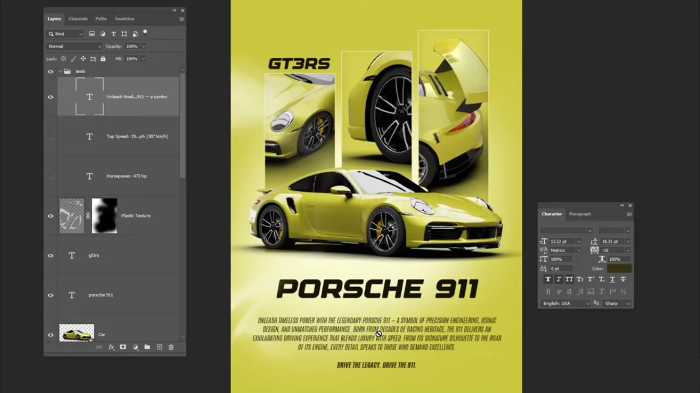
Inserting Car Images with Clipping Masks
Now it’s time to bring in the first car image and place it inside the top rectangle. This is where **clipping masks** come into play.
A **clipping mask** lets one layer (the image) show only where another layer (the rectangle) has pixels. It’s an essential Photoshop technique for non-destructive cropping.
Place and clip the first car photo
1. Drag your car image into Photoshop or use **File → Place Embedded**.
2. Position the image **above** the first rectangle in the **Layers** panel.
3. Resize the image with **Ctrl+T** so it fully covers the rectangle area, leaving enough margin for adjustment.
Now create the clipping mask using either method:
• Method 1 (keyboard-driven):
• Hold **Alt** and hover between the image and rectangle layers in the Layers panel.
• When your cursor changes to the clipping icon, click.
• Method 2 (menu-based):
• Right-click the image layer.
• Choose **Create Clipping Mask**.
The image now appears only within the rectangle, with clean, sharp edges.
Repeat for the other rectangles
For the second and third images:
1. Drag in the second car image and place it above the second rectangle.
2. Create a clipping mask as before.
3. Move and scale the image inside its rectangle until the car is framed nicely.
4. Repeat for the third image and rectangle.
Each car photo should feel like its own vignette but still part of a unified series thanks to the consistent rectangle styling.
Typography: Building a Clean, Readable Layout
Once your imagery is in place, it’s time to add text. You can start with prewritten text, or write your own headline, subheading, and paragraph copy tailored to the project.
Choose a primary typeface
A bold, modern font works well here. When choosing your typeface:
• Go for a **sans-serif** font for a clean, contemporary feel (e.g., Montserrat, Poppins, or a similar geometric sans).
• Use one family with multiple weights to keep your design cohesive.
• Avoid overly decorative display fonts for long text blocks.
• Make sure the font you pick has good readability at smaller sizes.
Avoid mixing too many fonts. Most posters work best with one primary typeface and maybe one secondary accent typeface if needed.
Structure your type hierarchy
Think of your text in three levels:
• Level 1 – Headline: Large, bold text near the top. This could be something like “Green Performance” or “City Drive Series.”
• Level 2 – Subheadline: Slightly smaller, placed near the headline, supporting it with more context.
• Level 3 – Body Text / Paragraph: A short paragraph near the bottom explaining the event, product, or collection.
In Photoshop:
1. Select the **Type Tool (T)**.
2. Click once for headlines (point text) or drag a text box for paragraphs.
3. Use the **Character** panel to adjust:
• **Font size**
• **Tracking (letter spacing)**
• **Leading (line spacing)**
You can also use **faux italic** and **faux bold** options for emphasis. You’ll find these in the Character panel, but use them sparingly:
• Faux styles are generated by Photoshop and can look distorted if pushed too far.
• Whenever possible, choose real italic or bold weights built into the font.
Adding a Plastic Texture Overlay for a Trendy Finish
One of the most distinctive touches in this design is the crumpled plastic texture overlay. It gives the poster a tactile, almost analog feel that contrasts nicely with the clean grid.
Step 1: Place the plastic texture layer
1. Drag the plastic texture image into your document and place it **above all other layers**.
2. Scale it with **Ctrl+T** so it covers the entire poster.
Step 2: Change the blending mode
To integrate the texture into the design:
1. With the texture layer selected, go to the **Blending Mode** dropdown at the top of the Layers panel.
2. Change it from **Normal** to **Screen**.
The **Screen** blend mode hides darker areas of the texture and keeps lighter highlights, which works perfectly for shiny plastic folds and reflections.
Step 3: Use a layer mask to control visibility
Next, use a **layer mask** to hide parts of the texture:
1. With the texture layer active, click the **Add Layer Mask** icon at the bottom of the Layers panel.
2. Select the mask thumbnail.
3. Press **B** for the **Brush Tool**, choose a **Soft Round** brush again.
4. Set **Foreground Color** to **black**. Painting black on a mask hides that part of the layer.
5. Keep **Opacity** at 100% but reduce **Flow** for gradual removal.
6. Paint over areas where you want the texture to be subtler—usually over faces, key logos, or key text.
If you toggle the visibility of the texture layer on and off, you’ll see a clear before-and-after that highlights how much more refined the poster looks once the texture is tailored instead of uniformly applied.
Pros, Cons, and Risk Management of This Photoshop Workflow
This workflow is powerful, but like any design approach, it has trade-offs you should consider.
Pros
• Highly **modular**: You can swap car images, change colors, and update text without rebuilding the layout.
• **Non-destructive**: Solid color adjustments, clipping masks, and layer masks mean you rarely have to erase pixels.
• **Print and digital ready**: The A4 setup works for both home printing and digital export.
• On-trend **aesthetic**: The plastic overlay and grid layout align with contemporary poster styles used in fashion and automotive branding.
Cons
• Heavier **file sizes**: Multiple high-resolution images and textures can make your PSD large and slow, especially on older hardware.
• Steeper **learning curve**: If you’re new to layers, masks, and blend modes, the workflow might feel complex at first.
• Potential **legibility issues**: Busy textures or bright colors behind text can hurt readability if not managed carefully.
Risks and how to manage them
• Risk: Printing looks dull or different from your screen
• Mitigation: Use **CMYK color** for print-focused designs and ask your printer for color profiles when possible.
• Risk: Blurry or pixelated images in the final poster
• Mitigation: Use high-resolution car photos and avoid scaling them up beyond their native size.
• Risk: Licensing problems with images or textures
• Mitigation: Only use **properly licensed stock photos and textures** and keep records of where you downloaded them from.
Mini Case Study: Turning the Tutorial Layout into a Launch Poster
To make the guide more practical, imagine you’re launching a limited-edition car wrap service in your city. Here’s how you could adapt the same layout for a real-world campaign.
Step 1: Reframe the imagery
• Top rectangle: A close-up shot of the car’s front end with the custom wrap.
• Middle rectangle: A side profile showing the full vehicle in motion.
• Bottom rectangle: A detail shot of the texture or branding on the wrap.
Each panel tells a piece of the story: power, style, and craftsmanship.
Step 2: Rework the text content
• Headline: “Limited Edition Green Wrap Series”
• Subheadline: “Custom performance looks for urban drivers.”
• Paragraph: A brief, two- or three-sentence description explaining the offer, availability, and city location. You could also add a short call to action like “Book your slot before they’re gone.”
Use the faux italic or bold accents to highlight words like “Limited Edition” or “Pre-order now.”
Step 3: Add a simple call to action
At the bottom of the poster, add:
• Your website URL
• A phone number or QR code leading to a booking page
• Social handles if they’re part of your brand identity
Keep these elements small but readable; they’re functional details, not the star of the design.
Common Mistakes and Expert Tips
Even with a solid workflow, it’s easy to stumble on the details. Here are frequent mistakes beginners make when following this type of process—and how to avoid them.
Mistake 1: Over-saturated colors
If you push the green too hard, the car and background can look artificial or clash.
• Tip: Use **Hue/Saturation** adjustment layers to fine-tune saturation and lightness. Aim for vivid but not neon unless that’s your brand.
Mistake 2: Misaligned rectangles
Slight misalignments can make even a good design feel amateur.
• Tip: Use Photoshop’s **alignment tools** with multiple layers selected. Turn on **View → Snap** and **View → Rulers** to help keep everything straight.
Mistake 3: Text lost in the background
Complex textures and gradients can make body text hard to read.
• Tip: Add a **subtle gradient overlay** or a low-opacity black box behind text, and avoid placing small text directly over busy image areas.
Mistake 4: Overusing faux styles
Faux italic and faux bold are handy but can distort letterforms.
• Tip: Where possible, install typefaces with real bold and italic weights. Use faux styles only for minor emphasis and check legibility at print size.
Mistake 5: Forgetting to group layers
A poster like this can easily balloon to dozens of layers.
• Tip: Group layers into folders (`Ctrl+G`) named **Background**, **Panels**, **Cars**, **Text**, and **Texture**. This keeps your PSD manageable and mirrors the structure of the overall workflow.
FAQs: Poster Design in Photoshop
Next Steps: Practice, Iterate, and Build Your Poster System
You’ve now walked through the full workflow behind a professional-looking car poster in Adobe Photoshop: from setting up the canvas, building your color-rich background, and constructing the rectangle grid, to clipping in car photos, styling type, and finishing with a plastic texture overlay.
The real power of this approach lies in repetition and adaptation. The more you practice with different subjects—cars, sneakers, products, album covers—the more you’ll internalize key habits: non-destructive editing, clean alignment, consistent type hierarchy, and thoughtful use of textures.
Your next move is simple: pick a new color scheme and a different subject, and rebuild the poster from scratch. Time yourself, take notes on any friction you feel, and tweak your process. Over time, you’ll turn this single guide into a personal library of reusable poster templates that you can deploy for clients, personal projects, or marketing campaigns with confidence.
Design Your Next-Level Car Posters with Adobe Photoshop →